Posts

Week Seven

Image
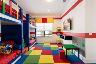
  Principles of Design Part 2 Rhythm Rhythm includes repetition, progression, transition or contrast. Its purpose is to direct someone’s attention around a space and enhance the overall impression of the room. Repetition and rhythm can be applied to color, texture, shape, or pattern. It leads the eye through a room to enjoy each aspect of the design. It is also used for wayfinding in commercial design. There are 5 main types of rhythm seen in design. The first is repetition. This is a repeated object, color, shape, texture, or any design element within an interior space. It gives the viewer a feeling of stability and predictability. The second type is gradation. This is uniformly increasing or decreasing the size of objects in a room to lead a viewer through the space.  The third type is contrast. This is when one object is used right next to another that is contrasted by color, size, or shape. This can draw the eye back and forth across a room. It gives a dynamic feeling of...

Week Six

Image
  Sketching Interiors In Chapter 6 of Sketching Interiors, we learned about texture in sketching. Using different materials and techniques allows different types of texture in drawings. As a designer, you should always carry a sketchbook with you because sketching the interiors and exteriors of buildings helps you understand the building better. Different materials are different colors and therefore require different shades and textures. Ink is usually the preferred medium used when an artist is traveling. It is important to be able to master the basic strokes before learning other drawing skills. Each pen stroke has a direction and must be placed with purpose and preplanning. Pressure applied can also determine a different stroke. It is also important to practice how to show shadows and openings because those are much more challenging.  This week our assignment was to sketch an interior from Chapter 6 in ink. This was a little challenging since I’m not very familiar with ...

Week Five

Image
  Culture Defining Color Culture is defined as a group of people that share similar lives and experiences. People use colors based on their backgrounds, age or other characteristics. Different age groups have different colors that they tend to like and use. Children tend to like primary colors. They respond best to bright contrasting colors. Teens tend to like bold colors and saturated hues. Adults enjoy expressive colors. Boomers like vibrant colors because their eyesight decreases. They also like contrasting colors to see the difference between objects.  Other aspects affect color choices such as social economics, gender or climate. Different income groups used to be shown by different colors, but not as much anymore. Gender colors are also less popular today but used to be more strictly blue for boys and pink for girls. Different parts of the world use different colors, as well as different climates which often reflect the landscape. For example, houses near the water o...

Week Four

Image
  This week we continued learning about color, paint, and pigments. We had a guest presenter who works for Sherman Williams. She went over color theory and color vocabulary with us as well as going into more detail about paint. She talked about how different colors affect our moods. She also discussed how the type of paint used in different rooms is important. Some paints have different ingredients which make them more water-resistant or scratch-resistant. You want more durable paint in rooms that get more use and wear and tear. We also learned that the finish of the paint is important. Some paints are more glossy or shiny which can cause the color to appear different to the eye. Warm Colored Interior Cool Colored Interior Sketching Interiors In Chapter 4 of Sketching Interiors, we learned the third perceptual skill of sketching which is the perception of light and shadow. This skill uses shading to create a sense of three-dimensional form and distance. Value means darkness and...

Week Three

Image
  This week in class we looked at the principles of design. We talked about the first 2 principles: Balance and Unity/Harmony. We discussed where you can see those principles in the designs around you and how those principles affect how a space makes you feel. We learned that designers must understand these key concepts in order to create an aesthetically pleasing and meaningful interior. The principles act as rules or guidelines to follow to achieve a successful and pleasing design. Balance Balance is about creating a sense of equilibrium in a space. It is adjusting the placement of different objects and elements in order to balance the visual weight in a space. You must also consider the line, color, shape, and texture when creating balance. There are 3 main types of balance: symmetrical/formal, asymmetrical/informal, and radial. Symmetrical balance is used mainly in more formal spaces. Each side of the space becomes a mirrored image of the other. Symmetrical balance is eas...

Week Two

Image
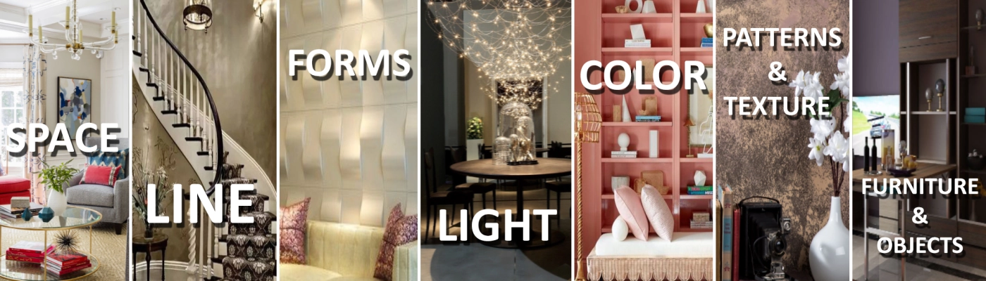
  This week in class we continued to learn about the Elements of Interior Design. We looked at the final 4 elements: Light, Color, Texture, and Pattern. We discussed how each of these elements affects interior design and impacts the people in the interior. Light Light sets the mood and atmosphere of a space. There are 4 main types of lighting that we discussed. Ambient lighting is the overall lighting. It illuminates an entire space and makes it feel welcoming. The number of lumens depends on the size of the room. The color temperature of the lighting can also affect the feeling of a space. Task lighting is for a defined purpose. It is focused lighting to meet the needs of someone. Accent lighting emphasizes objects. It highlights elements or features within a room and can create focal points. Mood lighting adds ambiance. It can sometimes be dramatic. Combining these types of lighting in an interior creates cohesiveness and balance and a space. There are also many different for...

Week One

Image
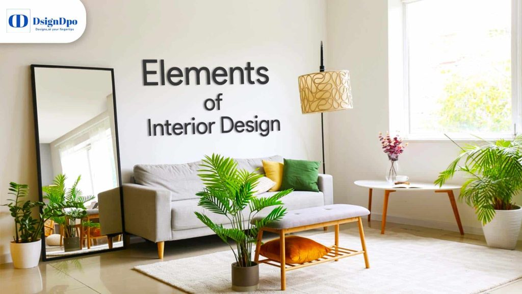
  The Elements of Interior Design This week in class we started learning about the Elements of Interior Design. There are 8 total elements: Point, Line, Shape, Form, Light, Color, Texture, and Pattern. We discussed the first four. Point is the most basic element. It is a stable point within a visual field and organizes the elements around it. It is often a focal point. A focal point is the place that people look at first. It is not always in the direct center and can cause tension when it is offset. A fireplace is a common built-in focal point. A line has many types each portraying a different feeling. Horizontal lines provide more restful and peaceful feelings whereas vertical lines give a more strong and powerful feeling. Diagonal lines often feel more unbalanced and energetic whereas curved lines feel more gentle and graceful.  Planes are seen more as the borders of the space being designed. The wall-places, ceiling-plane, and floor-plane. These planes create space or vol...