Week Four

This week we continued learning about color, paint, and pigments. We had a guest presenter who works for Sherman Williams. She went over color theory and color vocabulary with us as well as going into more detail about paint. She talked about how different colors affect our moods. She also discussed how the type of paint used in different rooms is important. Some paints have different ingredients which make them more water-resistant or scratch-resistant. You want more durable paint in rooms that get more use and wear and tear. We also learned that the finish of the paint is important. Some paints are more glossy or shiny which can cause the color to appear different to the eye.
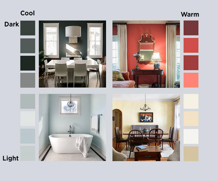
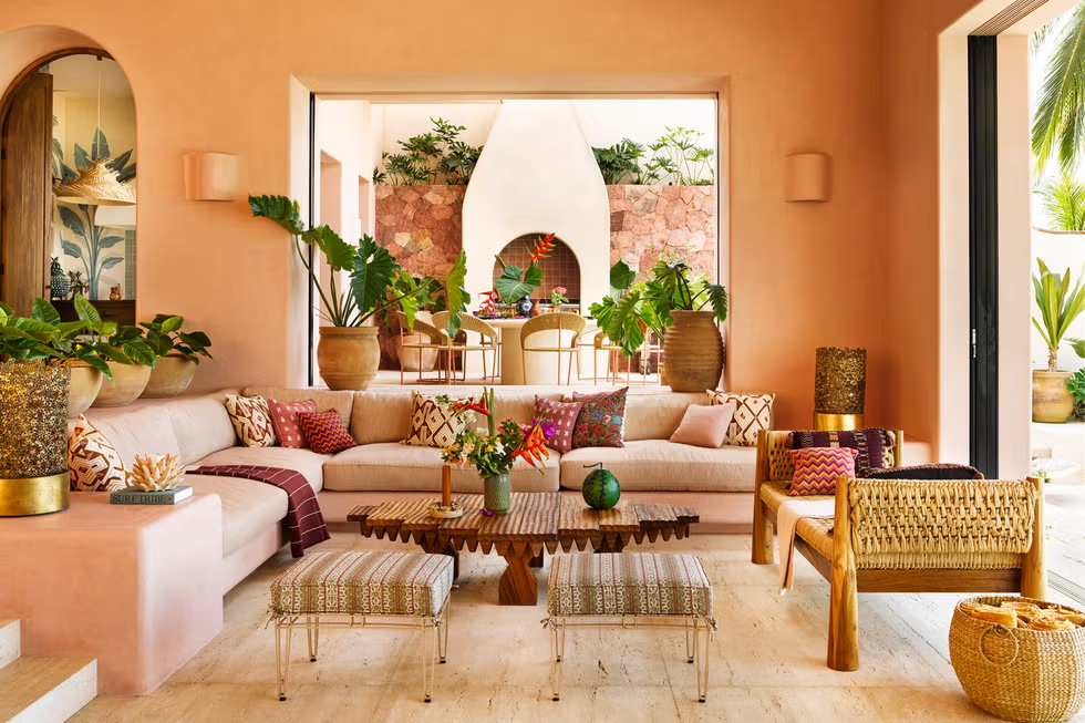
Warm Colored Interior
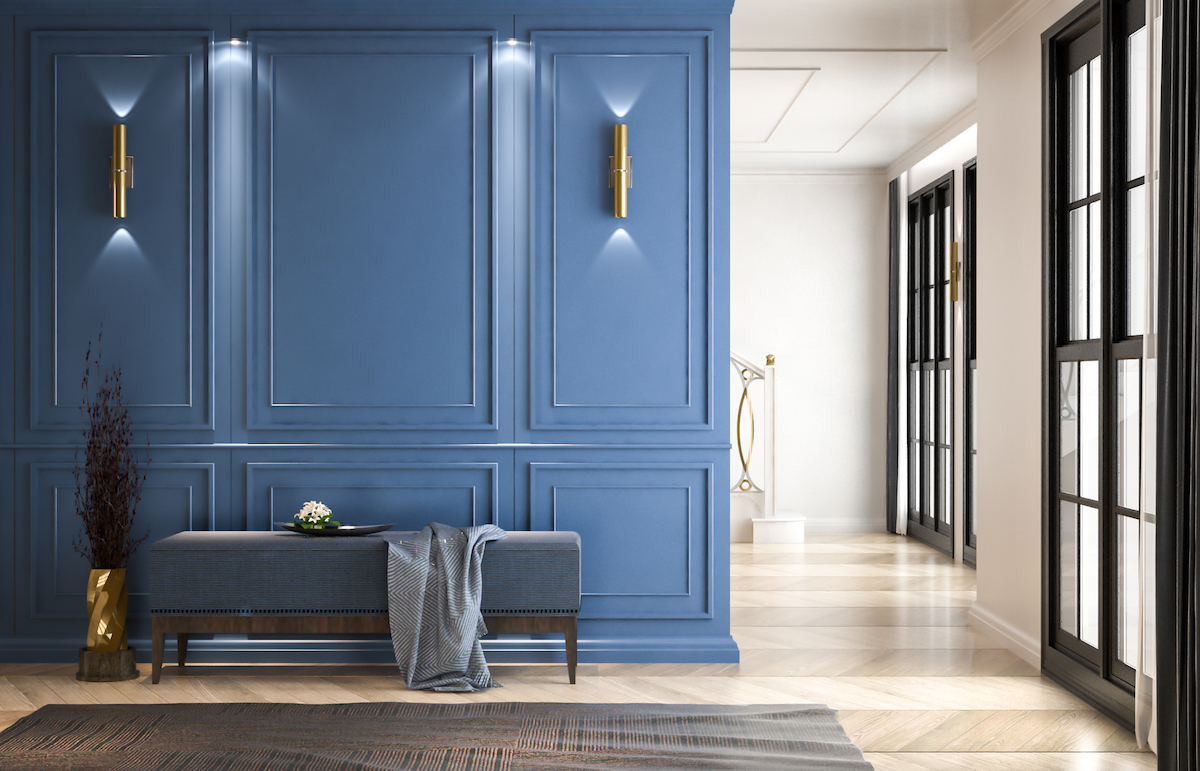
Cool Colored Interior
Sketching Interiors
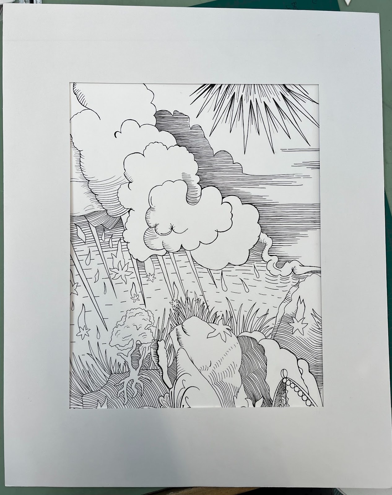
In Chapter 4 of Sketching Interiors, we learned the third perceptual skill of sketching which is the perception of light and shadow. This skill uses shading to create a sense of three-dimensional form and distance. Value means darkness and brightness. When observing what you are going to sketch, you must see different tones of light. Light tones are considered “high” in value whereas dark tones are considered “low” in value. When you sketch with only pencil, you must show different colors by using different shades of gray. Using different shades of gray makes a drawing much more realistic. It also adds depth and dimension to a sketch. The source of light on an object gives it definition. When looking at an object you can always identify the following lights and shadows: highlight, cast shadow, crest shadow, and reflected light. The surfaces that don’t receive direct light will be in shade. We learned that the best way to sketch this way and use the right side of the brain is to not draw outlines of shapes, but instead only the shadows. Shading and crosshatching can be used to create the variety of tones or values in a drawing. Leaving white on the paper can also be a very useful trick to portray the effects of light. Showing contrast in different objects is also very helpful in improving the drawing. Contrasting the main object or focal point can also help make the drawing appear more realistic. This week our sketch was practicing these different concepts by drawing an interior space focusing on the shadows rather than objects themselves.
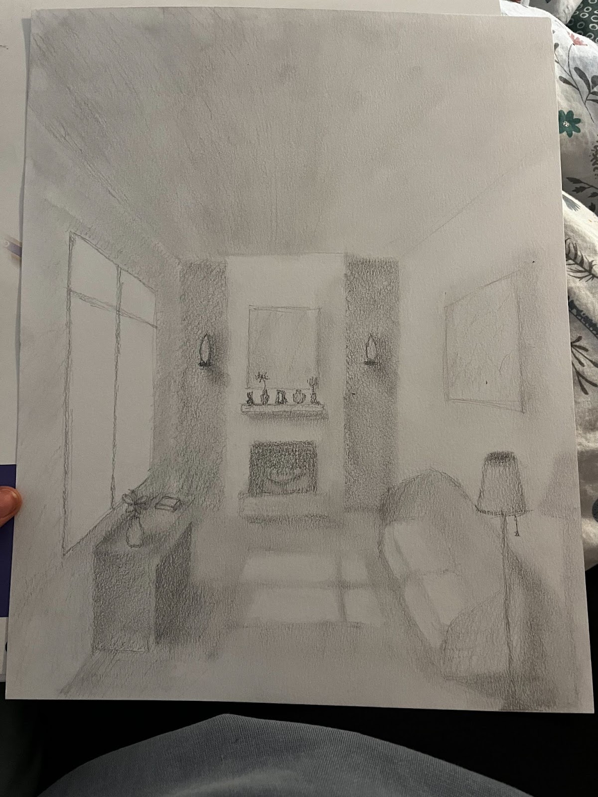
Sketch #5
Visual Wallpaper Assignment

Cara,
ReplyDeleteThank you for your summary on color from our guest speaker. I love the images you added that showed warm vs cool interiors, as well as light vs. dark interiors. You summarized the sketching assignment well. I loved your sketch! Your rendition of light and shadow was amazing. I thought your Wallpaper assignment was well done too! You included just enough detail to make me wonder.... 25/25 total points.
HI Cara your introduction is grat so are your sketch and wall paper is very detail
ReplyDeleteI really enjoyed your photos of warm and cool interiors. I also think your sketching assignment and wallpaper are something to be very proud of! Really nice work!
ReplyDeleteCara, i really liked your blog and thought you covered the topic well, while using interesting visuals and images to support it!
ReplyDeleteCara, your images for this color unit were great! And I felt you brought out many different schemes!
ReplyDelete