Week Five
Culture Defining Color
Culture is defined as a group of people that share similar lives and experiences. People use colors based on their backgrounds, age or other characteristics. Different age groups have different colors that they tend to like and use. Children tend to like primary colors. They respond best to bright contrasting colors.
Teens tend to like bold colors and saturated hues. Adults enjoy expressive colors. Boomers like vibrant colors because their eyesight decreases. They also like contrasting colors to see the difference between objects.
Other aspects affect color choices such as social economics, gender or climate. Different income groups used to be shown by different colors, but not as much anymore. Gender colors are also less popular today but used to be more strictly blue for boys and pink for girls. Different parts of the world use different colors, as well as different climates which often reflect the landscape. For example, houses near the water often have tan and blue accents which reflect the beach and ocean.

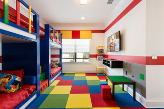
There have also been historical color trends which were mainly affected by economy, trends, and more. The 19th century was mainly known for the Victorian colors including mauve. The Roaring 20s used more subdued colors including black and white. The Great Depression brought muted hues focusing on white, beige, blue, and brown.
(Great Depression Colors)
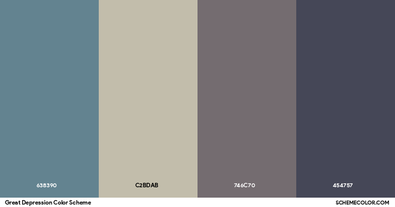
The Baby Boom in the 40s focused on brighter colors like pink, red, and yellow. The 50s brought turquoise and yellows mainly. The 60s brought bright psychedelic colors and tie-dye. The 70s had a lot of avocado color, brown, cream, and earth tones. The 80s focused on jewel tones like reds and blues. The 90s had eye-popping colors. The Millennium focused on gold, green, and bold accent shadows. The late 2000s brought a rise of grays and more.
(70s Inspired Interior)
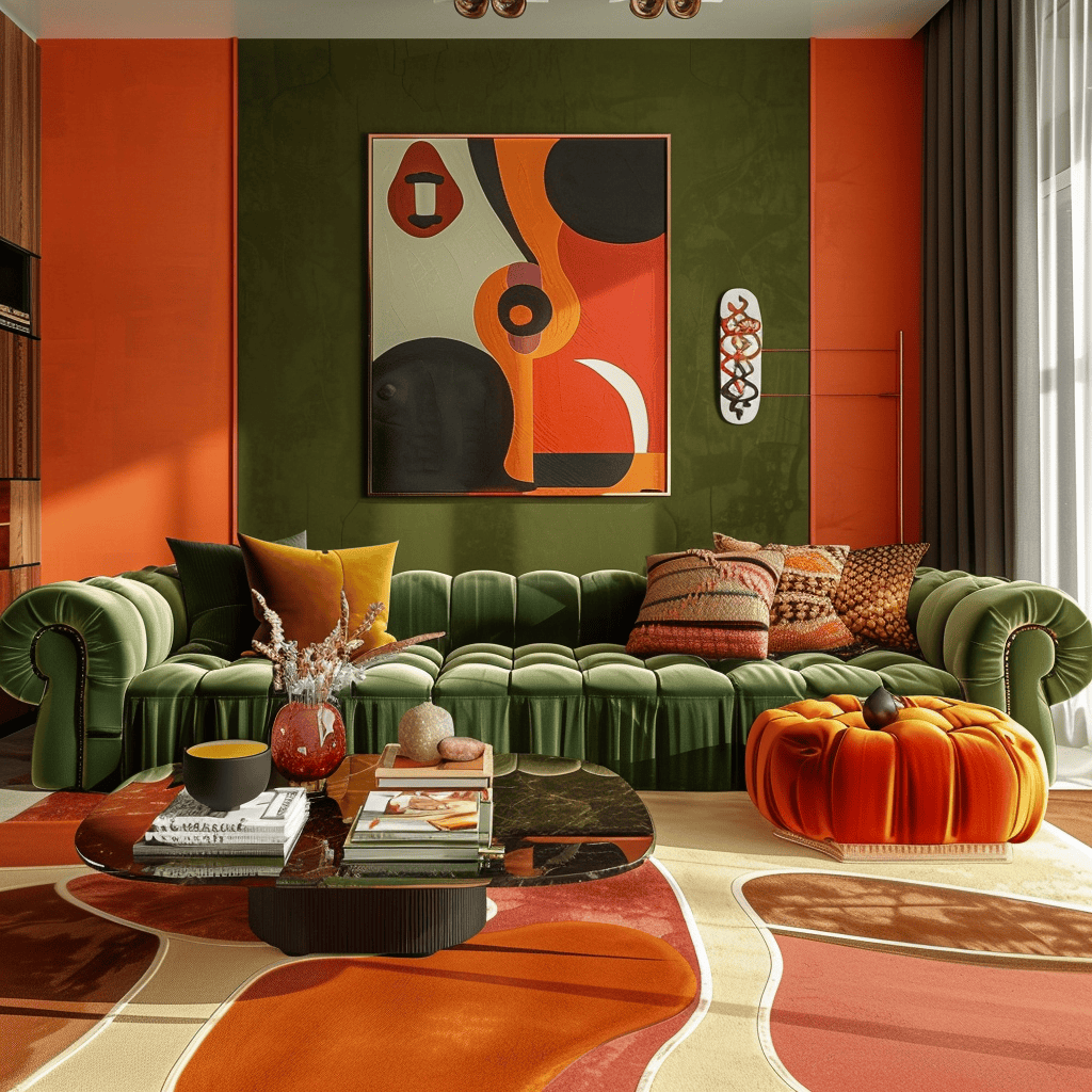
Ethnicity also affects the colors chosen. White usually means cleanliness and purity, but in some cultures, it means death and mourning. We often think of black as being death or evil but in some cultures it means rebirth. In African cultures they often use black for age and red for death or mourning. In Asian cultures red means good luck and happiness. In Hispanic cultures green is often patriotic. They also incorporate colors like red, yellow, black, and white as cardinal directions. In Indian cultures they often use bright colors like spices to portray different emotions. In Middle Eastern cultures green often means fertility, orange equals death and mourning, red means danger, and brown is birth and comfort. Native American cultures use blue, red, white, and black to display cardinal directions. In European culture, they use bright colors like green and blue tulips.
(Asian Interior)
Sketching Interiors
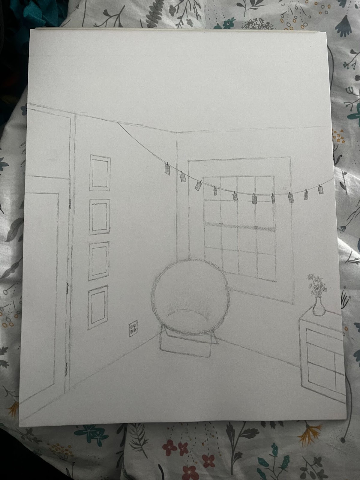
In Chapter 5 of Sketching Interiors, we began talking about spatial relationships and correct proportions. This is tricky for beginners because there are two main groups of skills needed. The first is being able to see angles relative to the planes of the space. This is also known as perspective. The second skill is being able to see proportions relative to each other in a space. Both of these together allow you to draw with correct perspective. There are three main methods you can use to lay out a perspective drawing: the freehand, estimated, or common method. You should also understand terms like horizontal lines, ground lines, vanishing points, cones of vision, different views, and picture planes. This week our sketch was to draw an interior space in one or two-point perspective.

Cara,
ReplyDeleteI love this Blog entry! You covered everything concerning color that we examined this week. I love how you summarized different people groups and their color preferences. The summary and images of historical color trends and ethnic trends was excellent. I thought your sketch was great! 25/25 points
Great blog this week! I liked how you talked about the different groups and time periods and the color preferences associated with that. I really liked your sketch too!
ReplyDeleteCara, great blog! I loved your images and summary of the information! I also really liked your sketch and the way you were able to draw and perceive 2-point perspective and 3D objects!
ReplyDeleteCara, great job this week! I loved your perspective as well!
ReplyDelete